MyBaseGuide
Context & Problem
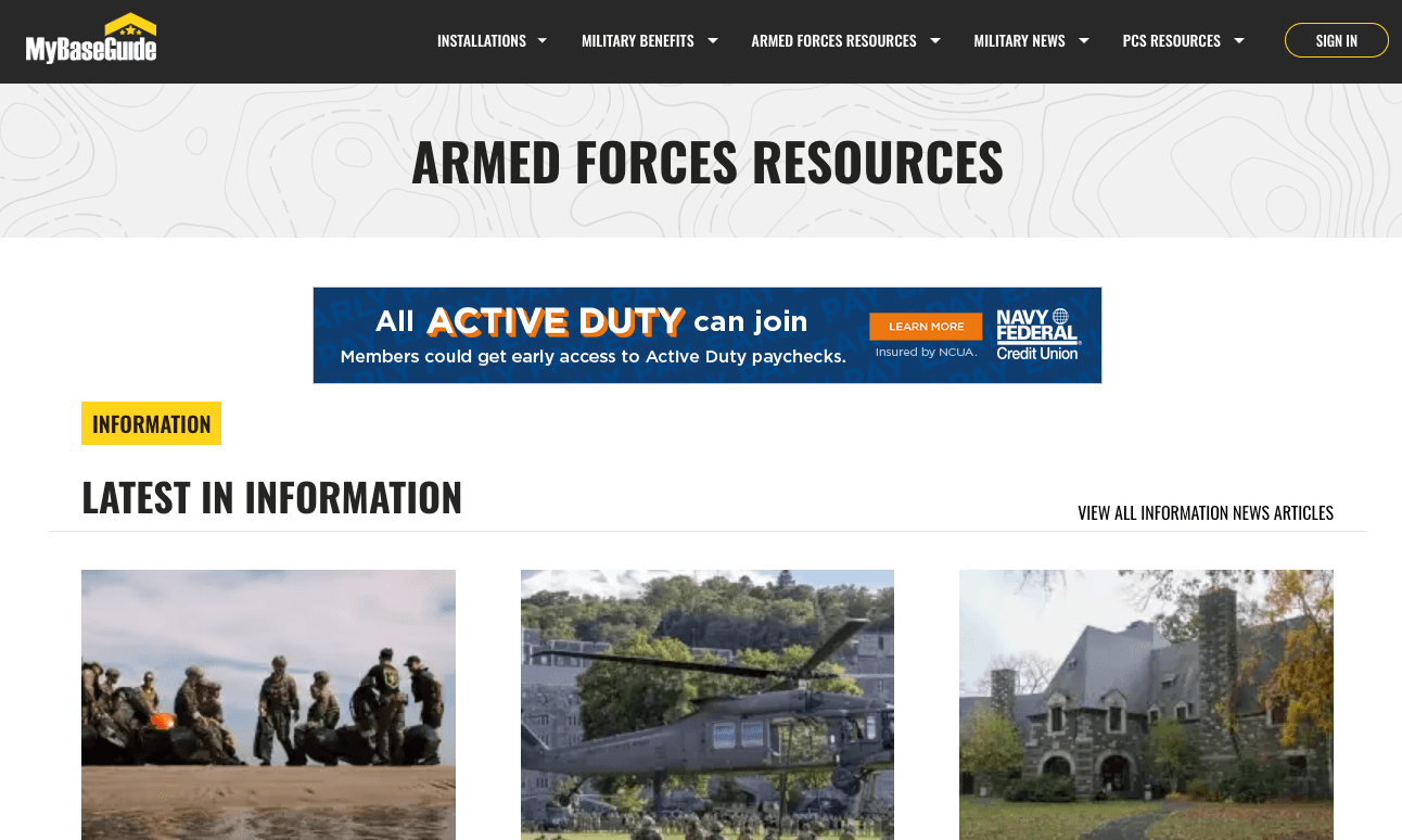
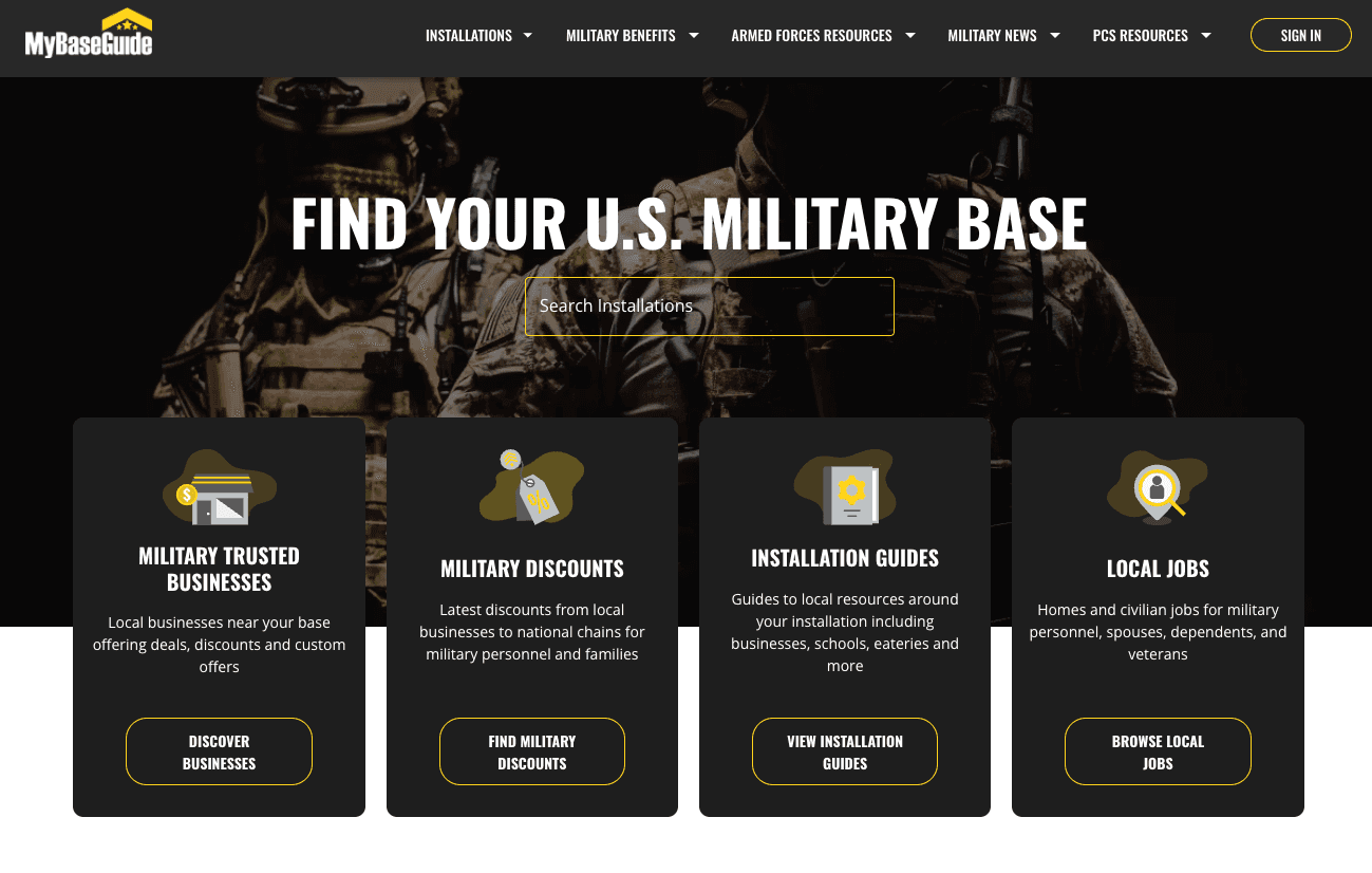
MyBaseGuide is an established military base resource platform that serves U.S. military families with base information, business directories, relocation guides, and military news. With thousands of monthly visitors relying on the platform for critical information during relocations and daily life, the site had become a trusted resource in the military community.
The platform was built on WordPress—a pragmatic choice that had served the business well for years. But as the content grew and the team's ambitions expanded, the WordPress architecture was showing its limits. Performance was degrading, the editing experience was clunky, and the codebase was becoming increasingly difficult to maintain and extend.
The business needed a complete modernization: migrate from WordPress to a modern tech stack, preserve years of SEO equity, maintain brand continuity, and do it all in one month. This wasn't a greenfield project—it was a high-stakes migration with zero room for error.
My Role
I served as both lead engineer and design lead for this project, wearing multiple hats to deliver under the tight timeline. This dual role meant balancing technical architecture decisions with design direction, ensuring both the engineering and user experience met the project's ambitious goals.
My responsibilities included:
- Technical architecture: Selecting the tech stack (Next.js, Sanity.io), designing the data model, and implementing the migration strategy to preserve SEO equity.
- Design leadership: Coordinating with two designers working concurrently, making final design decisions, and ensuring brand continuity while modernizing the visual language.
- Frontend engineering: Building the component system, implementing the page templates, and optimizing for performance and accessibility.
- Content migration: Developing tools and processes to migrate thousands of pages from WordPress to Sanity.io without losing SEO value or breaking links.
The Constraints
This project was defined by its constraints. Rather than viewing them as limitations, we treated them as the core design problem—the constraints forced clarity and prevented scope creep.
The four key constraints:
- One month timeline: The business had committed to a launch date, and missing it would impact revenue. Every technical and design decision had to account for the compressed timeline.
- SEO preservation: Years of organic search equity couldn't be lost. URL structures, meta tags, redirects, and site performance all had to be maintained or improved to avoid traffic drops.
- Content migration: Thousands of pages, images, and structured data needed to move from WordPress to the new CMS without data loss or broken relationships.
- Brand continuity: While modernizing the design, we couldn't alienate the existing user base. The site needed to feel familiar while looking fresh.
These constraints weren't negotiable. They shaped every decision, from technology choices to design patterns to team workflows. The project's success depended on respecting these boundaries while still delivering a meaningful improvement over the legacy system.
Technical Decisions
The technical architecture needed to balance speed of development with long-term maintainability. With only one month to ship, we couldn't afford to build custom solutions for problems that had proven answers.
Next.js + Server-Side Rendering
We chose Next.js for its excellent SEO story and developer experience. Server-side rendering meant search engines would see fully-rendered HTML, preserving the SEO equity we'd worked so hard to maintain. The framework's file-based routing and built-in optimization features let us move fast without sacrificing performance.
Sanity.io as Headless CMS
Sanity.io was a pragmatic choice based on team experience and timeline constraints. The team had used it successfully on previous projects, which meant we could skip the learning curve and focus on content modeling. Its real-time collaboration features and flexible schema made content migration smoother than expected.
The structured content approach also gave us flexibility for future features—content could be reused across different page types and even different platforms without duplicating data.
Component System for Content Editors
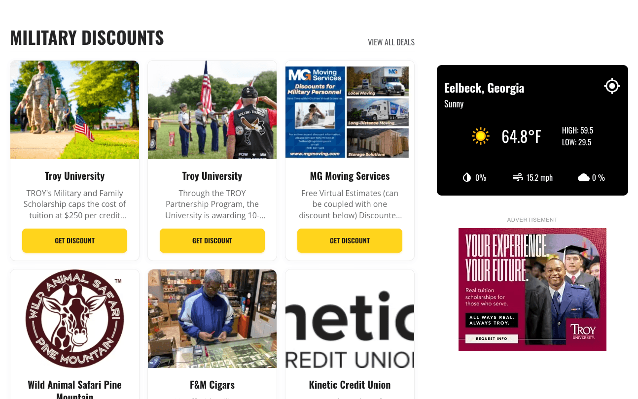
We designed a component system that gave content editors autonomy without requiring developer intervention for common tasks. Reusable blocks for business listings, base information cards, and article layouts meant editors could create new pages and update existing content independently.
This was critical for the business model—the team needed to publish content quickly to respond to military news and community needs. The component system balanced structure (maintaining design consistency) with flexibility (enabling rapid content creation).
Design Collaboration
Working with two designers concurrently under a one-month deadline required tight coordination and clear decision-making processes. We didn't have time for a formal design system or extensive documentation—instead, we relied on rapid feedback loops and pragmatic compromises.
Balancing Two Design Perspectives
Each designer brought different strengths: one focused on visual polish and brand evolution, the other on information architecture and user flows. Rather than forcing consensus on every decision, we divided ownership by domain—one designer led the homepage and marketing pages, the other led the content templates and directory pages.
My role as design lead was to ensure consistency across these domains and make final calls when perspectives diverged. This meant establishing shared principles (typography scale, color palette, spacing system) while giving each designer autonomy within their domain.
Legacy vs. Modern: Finding the Balance
The existing WordPress site had a dated aesthetic, but it was familiar to users. We needed to modernize without alienating the community. This meant keeping core navigation patterns recognizable while updating typography, spacing, and visual hierarchy.
We tested this balance by showing early designs to a small group of frequent users. Their feedback helped us identify which changes felt like improvements versus which felt disorienting. The result was a design that felt fresh but not foreign—evolutionary rather than revolutionary.
Speed Through Constraints
The tight timeline actually helped the design process. We couldn't debate every pixel or explore endless variations. Instead, we made decisions quickly, implemented them, and moved on. If something wasn't working, we'd catch it in the next review cycle.
This approach required trust—designers trusted me to implement their vision faithfully, and I trusted them to make good decisions without extensive justification. The constraint of time forced us to focus on what mattered most: serving military families with clear, accessible information.
The Result
We shipped on time. The new MyBaseGuide launched exactly one month after kickoff, with all content migrated, SEO preserved, and the design modernized. More importantly, the business saw immediate positive results.
Monthly ad revenue increased by 22% in the first quarter after launch, driven by improved page performance and better ad placement opportunities in the new design. User engagement metrics (daily active users, weekly active users, monthly active users) all showed increases, suggesting the modernized experience was resonating with the community.
The team's effort was recognized company-wide—everyone involved received a week off and a public thank you from leadership. But the real validation came from users: the site continued to serve military families without disruption, and the new CMS empowered the content team to move faster than ever.
The key learning: Constraints force clarity. The tight timeline and non-negotiable requirements eliminated bikeshedding and scope creep. We couldn't build everything, so we built what mattered. The result was a focused, effective solution that delivered real business value.